Do you want to convert visitors into leads by learning how to create a landing page?
If you do, welcome to the lovely world of the landing page. A killer landing page encourages visitors to take an interest in your product or promotion, making it an incredibly powerful tool in a digital marketing campaign.
Efficiently managing and updating all your landing pages is all-important to ensure they remain fruitful and responsive across various devices.
Are you interested? We thought so. Let’s look further into this superb marketing tool.
- What Is a Landing Page?
- Why Do You Need a Landing Page?
- How to Create a Landing Page
- How to Easily Create Landing Pages That Convert
- Landing Page Copywriting Tips
- How to Create a Landing Page for Free
- How to Design Your Landing Page
- The Future of Your Landing Page
Blog Highlights
- What is a landing page: In plain English, we quickly explain what a landing page is, the ingredients it’s made up of and how they work together to create conversions.
- Landing page copywriting tips: We can’t promise to turn you into the next George R. R. Martin or Stephen King, but we can help you understand what your potential customers are looking for, the research needed to attract them, and we also give you a list of peerless headlines for inspiration.
- How to create a landing page for free: Does free always mean good? Here, we supply an example of how to create a mock landing page to save time. That way, you can see how the colours and images we taught you how to use will look. The result will be beautiful landing pages that add value to your digital marketing strategy.

Source: Envato
What Is a Landing Page?
It’s all about contact information. A landing page is a web page created to collect a visitor’s information in exchange for an offer, such as an e-book, a video, or a set of templates. This works in 3 distinct ways:
- The landing page first tells the visitor about your product or service.
- An online form is often present that the visitor fills in to get their reward.
- An email is then sent offering more information via a demo or a consultation.
Again, the overall goal is to try and get a conversion.
Regarding content and visual elements, the landing page eliminates distractions to encourage visitors to sign up. The page should be uncluttered, direct, stimulating but not overloading. The options presented are sparse to convince the visitor to click on a singular Call-To-Action button (CTA).
When you decide to build landing pages, try to think of a single road and not a large junction. The landing page content should be customized to amplify conversion rates and align with UX best practices.
Definition & Purpose
A landing page is a standalone web page designed with a single focus: to convert visitors into customers or leads. Unlike other pages on your website, an exceptional landing page is crafted to promote a specific product, service, or offer and persuade visitors to take a desired action, such as filling out a form or making a purchase.
Most landing pages are typically used in conjunction with paid advertising campaigns, like Google Ads or social media ads, to drive traffic and increase conversions. By eliminating distractions and focusing on a singular goal, landing pages can considerably boost your marketing campaigns and deliver measurable results.
Popular Types of Landing Pages
There are several types of landing pages, each tailor-made to achieve a specific objective. Here are a few different types of landing pages you might consider:
- Lead generation landing pages: These pages are designed to capture visitor information, such as email addresses or phone numbers, in exchange for a free resource or offer, like an e-book or a discount code. They are perfect for building your email list and nurturing potential customers.
- Sales landing pages: Focused on promoting a specific product or service, sales landing pages aim to persuade visitors to make a purchase. They often include detailed product descriptions, benefits, customer reviews, and a compelling call-to-action.
- Event landing pages: If you’re hosting a webinar, conference, or any other event, an event landing page can help you promote it and encourage visitors to register or attend. These pages typically feature event details, speaker information, and registration forms.
- Informational landing pages: These pages dispense valuable information to visitors about a specific topic or industry. They are often used for educational or awareness purposes and can help establish your authority in a particular field.

Source: Envato
Why Do You Need a Landing Page?
Sure, this is a good question. Why not just rely on your existing home page or about us page? As we mentioned before, the answer is to eliminate distractions and reduce friction.
In a word, a simple landing page makes decision-making easier: One click is all you need.
How to Create a Landing Page
Before making a landing page from scratch, you should start by putting yourself in the shoes of your visitor. How will your product or service help them with their business or everyday goals? And if you’re asking the visitor to fill in an email address, what information can it contain that the visitor wants to know more about? Once the email has been opened, what should be on a linked thank you page?
The trick is to expand even more on the value of your proposition, offering more information or personal contact, such as a phone or video consultation. These movements take the visitor down a tasty conversion path.
When we’re asked how to create high converting landing pages, our first answer is to say look at your value proposition in detail.
Hold On, What Is a Value Proposition?
In brief, it answers the question in your visitor’s mind: What’s in it for me? It’s a statement—the shorter, the better—that explains why visitors should buy your products or services. It offers a solution to the visitor’s pain point in a way that promises value. You want to use it to make your business and its offerings appealing.
In regard to an SEO element, you want to try and sprinkle some relevant keywords into your message. And don’t forget to include some of them in your meta description. That way, your site can also attract the interest of search engines.
Here are 5 good ingredients to spice up your conversion path:
- A cracking headline that immediately grabs the attention of a visitor.
- A subheadline that persuades and sits comfortably under your headline.
- A sublime hero image that looks good, tells a visual story and is relevant to your visitors.
- If you want to collect information in a form, then this is your next additive. The form should be easily accessible by being above the fold.
- A CTA that is not only purpose-driven but also hypnotic, easily inducing a click.
Specify a Goal for Your Landing Page
To build a high-converting landing page, it’s necessary to specify a clear and measurable goal. What do you want to achieve with your landing page? Do you want to generate leads, sell products, or promote an event? Knowing your goal will help you determine the type of content and design elements to include on your landing page.
For example, if your goal is to generate leads, you might focus on offering a valuable resource in exchange for contact information. If you’re aiming to sell a product, your landing page should highlight the product’s benefits and include persuasive elements like customer reviews and a strong call-to-action. By having a clear goal, you can create a more focused and helpful landing page.
Research Your Market & Competitors
Researching your market and competitors is paramount to creating a successful landing page. Start by understanding the language your target audience uses and the questions they’re asking. This will help you craft a message that resonates with them.
Next, analyze your competitors’ landing pages. Identify what elements are working for them and note any standout features, such as customer reviews, trusted logos, or countdown timers. This competitive analysis can give valuable insights and help you create a landing page that stands out in your market.
But Mr Jones, You Didn’t Tell Us What the Fold Is?
Sorry, I was just coming to the science part. Above the fold means the top section of a newspaper. Imagine folding your newspaper in half just before you tuck it under your elbow. To further reduce friction, you don’t want visitors having to unfold the newspaper—what we’ve come to know as scrolling. If you want to eliminate scrolling, think above the fold when creating landing pages.
How to Easily Create Landing Pages That Convert

Source: Unsplash
- Think about your audience and make your goal attractive to them by creating high-converting landing pages.
- Write wonderful and engrossing content.
- Choose your landing page design carefully.
- Create a simple form for collecting details.
- Attach a convincing and exciting CTA.
Your Audience
Have you researched the persona of your target audience? You could start by creating a list of their attributes and include their age, the job they do, how they dress, their primary interests, and their goals that you can help them to complete. You could use what journalists call the 5 Ws. In creating the opening paragraph of a news story, journalists aim to include required details such as:
- Who: Asks about the person.
- What: Ask what the action is.
- When: Asks about a time when they might buy a product.
- Where: Asks about a place, where does the audience reside?
- Why: Ask about reasons, perhaps their reason for clicking your CTA.
This five-point list is fantastic to use when creating landing pages, no matter what business you are in.
Source: Envato
Landing Page Copywriting Tips
The Content
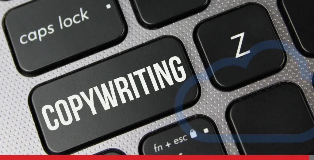
Your headline (H1) should be a simple mixture of what you are offering and its benefits. The headline should obviously be compelling but short; we recommend keeping it to 10 words of around 55 characters. This is easier on the eye and good for your page’s Search Engine Optimization (SEO). As an example, here are 5 blog titles we have on our EasyHosting blog page:
- The 24 Best Email Marketing Software of 2024
- How To Sell Products Online: Our Step-by-Step Guide
- 12 Top Digital Products That Sell Well
- How Does Website User Experience Impact SEO?
- 6 Simple Steps to Host Your Website in 2024
We recommend following up your headline with subheadlines that are just as good but that have persuasive pieces. With your subheadline, you can add more depth and details than are in your headline.
No Pain, No Gain
If you have researched your audience well, you should have a good idea of their pain point. The next thing to consider is how the solution you offer will work for them. What benefits does your product or service offer, and what social proof can you provide?
The tone you use should be focused on how you can help your audience, not on your business’s incredible achievements.
For instance, let’s say the customer works in human resources, and you are offering email templates. How do your templates cover issues such as job interview offers, onboarding, or vacation leave? Try to stick to the product’s details rather than your business’s.
If you add that your HR email templates are free, your audience will be more than willing to move on to the next section of your landing page, which is an information form to be filled in. After all, you are offering a solution in exchange for a small selection of their personal information.
EasyHosting Tip: To truly win over a visitor and potential customer, outline their objections. We don’t mean mind reading, but simply putting yourself in the visitor’s shoes. What might put them off clicking that CTA button?
When you hit publish you’ll know your perfect landing page will give you an increase in email marketing opportunities and drive traffic to your online store.
Be so good they can’t ignore you.
Steve Martin, Born Standing Up: A Comic’s Life
How to Create a Landing Page for Free
Source: Unsplash
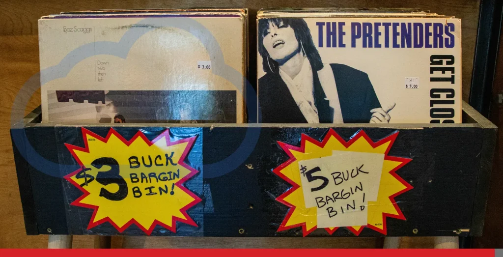
Another approach you could consider is to try using a free landing page builder that allows you to create landing pages quickly. These tools are easy to use and offer valuable features like automation and customization options, helping businesses drive sales and engage customers.
A better option would be to get yourself a free landing page builder in the form of our DIY Website Builder or use our professional website design plan, where we take care of everything for you.
You can also talk to us about the fantastic web hosting we provide or simply upgrade your current hosting package. At EasyHosting, we can supply a package that includes your first-year domain registration at one easily affordable price.
How to Design Your Landing Page
Source: Unsplash
Designed for Life
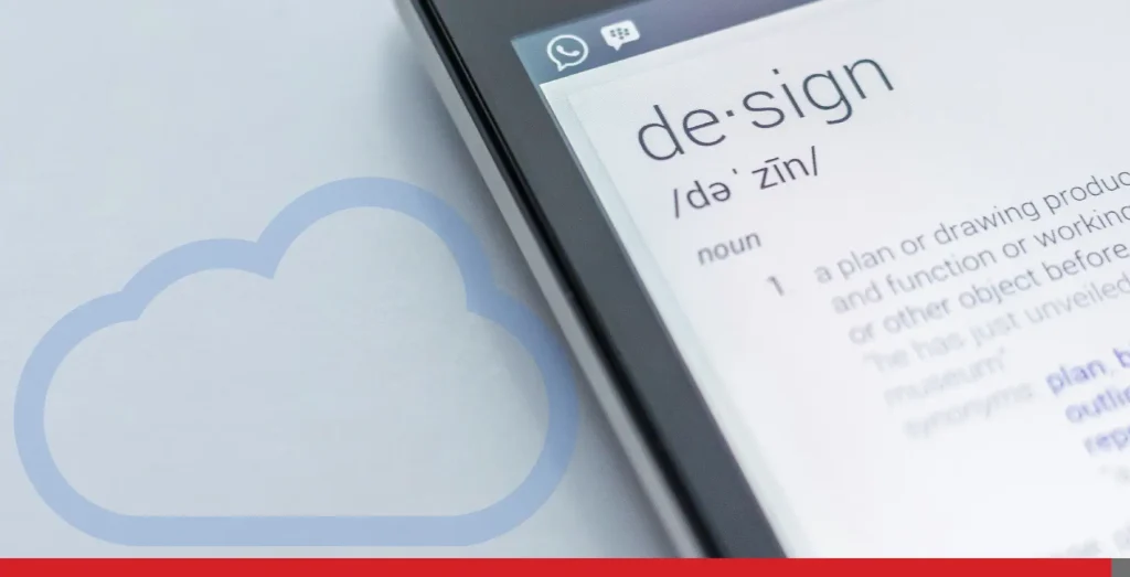
Your landing page design should match your brand while also capturing the goal of your visitor. If you’d like to customize your landing page yourself, here are some handy hints to get you on your way:
Colours
You can always use your brand’s distinctive colours. However, if you’d like to experiment, why not look into colours more deeply?
Colour theory has been used for a long time in design, decorating, and brand marketing. When you get time to sit down to figure out how to create your first landing page, you might factor in some time to watch a movie. It just so happens that the movies is also a place where you may have encountered colour theory without knowing it. For example, did you know:
- Directors Don Siegel and Sam Peckinpah often used the colour red in backgrounds to warn the audience that the main character was in danger.
- David Lynch used the colour gold at the beginning of his 1984 movie Dune to indicate royalty and power.
Layout
EasyHosting recommends using the Z-pattern for landing page layouts. The idea of the Z-pattern is that the visitor’s eyes begin looking at the top left of the page, then move horizontally to the top right of the page, then make their way down to the bottom left of the page before moving horizontally once more to the bottom right of the page.
The Z-pattern is ideal for landing pages and helps the reader scan the most important parts of the page and, more than likely, end up on the CTA button.
Images
A good image adds value to your overall landing page message. The image must be something the audience can relate to while also representing their goal. The image you use should accompany the message of your landing page but not overpower it. For something really eye-catching, consider having some custom illustrations made. In terms of a hero image size, aim for a horizontal size of 1024 pixels with a vertical size of 512 pixels.
Choose a Hero Image
Many landing page creators use what’s known as a hero image. This is a large, attractive image that appears at the top of the website. The hero image, along with a business logo, should catch the visitor’s eye immediately. Together with good text, it’s an exceptional marketing tool.

Source: Envato
Make It Mobile-Friendly
With the majority of internet users accessing websites through mobile devices, it’s essential to make your landing page mobile-friendly. Ensure that your landing page is perfect for mobile devices, with a responsive design that adapts to different screen sizes and devices.
The Form That Follows Function
To collect email addresses and names to supply more information to your audience, make your form simple. If you’ve been wondering how to make your landing pages more powerful, then we suggest you focus on building trust with visitors. You can start by asking for only 4 details when creating landing pages and the forms to go with them:
- The visitor’s name. (Do this first to make a personal connection.)
- An email address.
- More information: Their workplace or job title.
- Location: Try sticking to their province or country.
A memorable and successful landing page URL can also notably strengthen the user experience and upgrade conversion rates.
Try not to ask for phone numbers and home addresses if possible. Think simple: Think of 4 questions and no more.
EasyHosting Tip: Don’t ask for too much information on your form. Unfortunately, we live in an age of cyber threats, which makes people reluctant to share too much information.
The All Important CTA
A good CTA is like the arm on a slot machine. It really only needs to be pulled once for you to get the jackpot. The call-to-action (CTA) is the single most important element on your page. Out of all landing page best practices, it is the prime winning factor. Try to be daring without being aggressive. Avoid the word ‘Submit’ and go for something that is both exciting and stormy.
Here are some example CTAs to inspire you to win that all-important click:
- Download An E-book.
- Register For A Coupon.
- Sign Up For Our Newsletter.
EasyHosting Tip: Keep it simple, have one CTA, and make the process as easy as possible.
The Future of Your Landing Page

Source: Unsplash
Moving forward with your new landing page, you’ll want to consider adding testimonials and tracking page metrics to keep an eye on the page’s productivity.
Testimonials
A good testimonial is social proof that your CTA button is worth a click. The idea is that you convince your landing page visitor that their life will be much better if they accept your offer.
One factor to consider is in the shape of testimonials from your customers. You want to make these as attention-grabbing as possible. So, make sure to use pictures of your customers together with their text reviews. Videos should also be on your to-do list when creating landing pages.
Landing Page Metrics That Will Help Your Business
Once you’ve put in all the hard work and crafted a hypnotic landing page, it makes sense to check it works—right? The best time to start tracking is as soon as your landing page goes live. Once you get started, you’ll discover any areas of your page that are not selling themselves well. This means you can then tweak everything until you see the healthy conversions you’ve been dreaming of.
Integrating Google Analytics is crucial for tracking visitor behaviour and campaign performance.
Here are 3 metrics you could start to keep an eye on, to begin with. You might also want to consider learning how to use Google Analytics. There are lots of online courses, many free, to help you get to grips with the latest version known as Google Analytics 4.
And don’t forget that SEO is a terrific area to boost to see more conversions.
- Page Visits
On average, how many visitors is your landing page receiving each week? Obviously, more visitors will result in more conversions. But also take a moment to ask if you’ve kept your brand in the minds of your visitors. Perhaps it’s time to plan an email marketing campaign to attract more users to your website.
- Bounce Rate
If visitors arrive at your landing page and make for the door at the speed of an Olympic athlete, you probably need to overhaul your page. Ask yourself if the content you’ve written matches and lives up to the offer you’re putting in front of potential customers. Is it clear what a visitor needs to do when they arrive on the landing page?
- The Source of Your Traffic
Is most of your traffic composed of people accessing your landing page via a desktop computer? If you notice a lack of smartphone users visiting you, double check your landing page and website look good on a smaller screen.
At EasyHosting, we’ve helped lots of our customers choose from engaging, mobile-responsive website themes that automatically look fabulous on desktop, mobile, and tablet devices.
In Summary
Source: Unsplash
The topic of how to create a high-converting landing page has many ingredients.
Your best assets when creating them will be patience, determination, and taking your time to keep testing your new landing page—to make it delicious and irresistible.
And why struggle on your own when you can get in touch with EasyHosting?
Need help to get more people to convert to your eCommerce store online?
Reach out and speak with us today!
Call us: 1-888-390-1210


